Wednesday, 28 November 2012

mission statement

                                        
                                       My Mission Statement


 My magazine will give a unique insight into the music industry.  It will be predominantly basic on a rock genre also featuring other alternative artists.  It will be aimed at an age group from 16-30 of both males and females. Purchasers would be regular music listeners with an interest in live music or be musicians themselves.  The magazine would take an informative angle providing news, concert dates and reviews, as well as advice and tips for aspiring musicians. The tone and attitude would also have a quirky aspect to interest younger readers, some articles such as album reviews and interviews would have a fun and relaxed attitude.  It would be a glossy but lengthy publication to provide detailed content released on a monthly basis.  It will gain its following by providing the latest, up to date information on the rock scene as well as features and interviews with well known artists. The magazine will also incorporate fashion and band merchandise associated with the genre and the latest entertainment news.

Monday, 12 November 2012

contents draft

final draft magazine cover!


Music Magazine Covers (class notes)

THE IMAGE
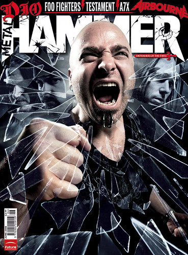
-If there is a person / group on the cover, what do they represent?
-Are they a stereotype?
-How has the stereotype been constructed?


THE GAZE

-The gaze refers to the direction in which the person on the cover is looking.
-Are they looking straight at the audience?
-Are they smiling- enticing the reader in?
-Do they look friendly or cool?
-Do they look seductive?


THE MISSION STATEMENT

-Create a mission statement for you music magazine.
Read the example for the women's magazine "Frank" and develop the following ideas for your own magazine.

-Explain what kind of music magazine you hope to create by focusing on genre and style.
-Explain the audience that you are trying to target.
-Give a brief overview of the content of your magazine.
-Describe the tone and attitude of your magazine.
-Explain the role that you think your magazine will play in the lives of its readers.

Sunday, 4 November 2012

Choosing a genre for a music magazine

I looked at a selection of music magazines in order to make a final decision on which genre to base my magazine on.

POP

 
This is one of the pop music magazines I looked at , it's extremely popular and well known. When looking at the codes and conventions I noticed that though the masthead is fairly unique in this magazine, most pop music magazines are very similar. They seem to be mostly marketed at females, using feminine colour schemes and female features as displayed in this magazine such as fashion and make up tips. I wanted to create a more unique magazine and am not particularly interested in the pop genre anyway so I ruled it out.

HIP HOP


When researching hip hop magazines I came across "VIBE" magazine. I really liked the codes and conventions used, and the cover appeals to me . I liked the simple layout and the bold fonts used. But again I don't know a lot about the genre itself.


Alternative


I really like NME magazine because it covers a range of genres. Images are usually very unique and the stories are purely about music , it's aimed at both sexes and features exclusive information. I considered creating a music magazine of mixed genres such as this but ultimately for this task I think it would be better to stick to one genre and keep a continuous theme.

ROCK MUSIC


I decided to pick the rock/metal genre for a number of reasons. It is personally my favourite genre, so I know a lot more about it. I also purchase this genre of magazine, so I am used to the codes and conventions that they use. Main colour schemes usually include red,white and black as they stand out, exclusive news and posters are almost always featured. The other thing that is mostly unique to the rock genre is dates for gigs and concerts, and reviews of live shows. I particularly like that aspect.


 I also find that main images in rock magazines are a little more unique, when I take my main image I feel that I will be able to experiment with it more as a rock theme than I would have been able to with for example a pop magazine.
    
I will create a questionnaire about this genre of music magazine to gain feedback on what I should include and conduct further research.

Tuesday, 30 October 2012

Contents Pages


            CONTENTS PAGES:

 1.The function of a contents page is to allow
   the reader to see what features the magazine
   contains and where they are located within the
   magazine. It enables them a quick method of
   navigation through the magazine, where they
   can easily find the articles they are most
   interested in reading.

 2.A reader uses the contents page by scanning

   the information to see which articles they are
   interested in and they using the corresponding
   page reference to find it.


 3.A conventional layout for contents pages
  
includes a heading such as "contents" or
   "features" etc. They almost always feature
   images related to the main articles, with the
   corresponding page references in bold. A
   selection of the smaller articles are then listed
   with their page references in columns. Layouts
   vary depending on whether the contents page
   is a double page spread or single. For example,
   a double page spread is more likely to have more
   than one column of page references.
4.A conventional design for a contents page
 
typically includes a bold heading, white background
  so that the articles and page references are clear
  to read and a selection of additional images. Fonts

  are generally simple and easily readable and images
  are easy to identify. Sometimes shapes such as
  arrows, circles, or stars are used to highlight certain
  information.


5.The amount of information that contents pages contain
  may vary. Again it usually depends on the size of the
  magazine. They usually contain a lot of information,
  but about multiple topics. Text information gives a small
  insight into what each article is about, but nothing more.
  Whilst photographic information allows us to visualise it.
6.The content of its information includes page
  references, small amounts of information about
  articles and perhaps a message from the magazine editor.
7.Images are used on the contents pages to help the
  reader recognise articles more quickly. They are often
  placed in the centre if the contents are on a double
  page spread. Depending on the amount of content
  within the magazine, there may be more or less images.
  Some contents pages have a main image for their main
  article if it's particularly important. Others have
  multiple images of equal size.

 (Empire magazine often uses a double page spread with ten images in  the centre which include pictures of the actual articles for the reader to see)


8.The language used is often not complex, it is simple
  and easily understandable for the reader. It is
  often aimed to be attractive to the reader and
  as there is little space to give information
  about each article, sometimes slang or abbreviations
  are used. As well as witty or catchy titles to
  interest the reader.


 9.The key codes and conventions include a heading
   that shows or implies that it is a contents page,
   in a bold and clear font which is easily
   identifiable . As well as clear, well
   organised layouts of text and eye-catching font.
   There will always be page references that
   are straightforward for the reader to find,
   and images that are key to the articles inside.


 10.The function of a contents page prevents it
    from being overloaded with text. The layout
    must be spaced out and clear so that readers
    can find page references with ease and must
    only contain small chunks of texts. The 
    article descriptions must be short but still
    gain the readers' interest and correspond
    appropriately to their content. Because the
    function of a contents page is to allow the
    reader to navigate through the magazine, the
    layout needs to include an image/images
    corresponding to the main article/articles
    to allow certain pages to be easily located.
    And also needs to make page references
    stand out to the reader using bold text or
    colour against a white background which
    affects the design.


Friday, 19 October 2012

New cover with picture

This is my school magazine cover after inserting my main image. It is not my final draft and I still hope to edit it further. I need to add a bar code and price and I would like to make the image fit better to make it look more professional. I have changed some of the fonts however I still plan to change the colour of some texts to make them more eye catching. I have kept my original masthead and banner as I think they work well.